Dashboard at a glance
The workspace dashboard combines four things on one screen: your current mention rate, what's changed since the last scan, the queries that matter most, and a short list of recommended next steps.
Priority Queue
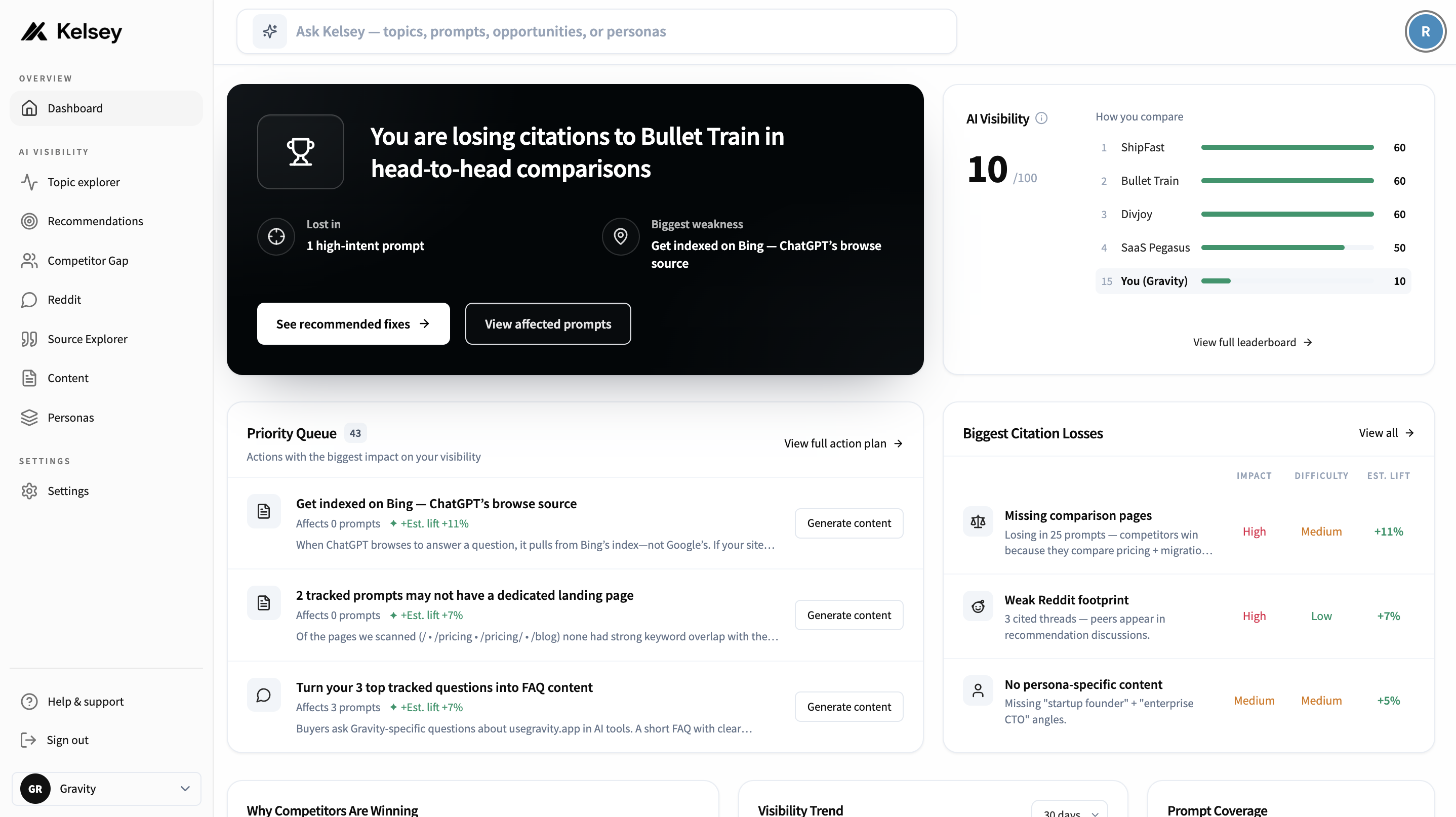
The Priority Queue sits at the top-left of the dashboard. It's a ranked list of the highest-leverage actions you can take right now to improve how often AI assistants cite you. Each card shows a single, do-able action — not a vague "improve your SEO" suggestion.
Each card includes:
- Action title — e.g. "Get indexed on Bing — ChatGPT's browse source".
- Affects N prompts — how many of your tracked prompts the action would move.
- Est. lift — the % visibility gain we expect if you complete it.
- Why it matters — one or two lines of context.
- Start a page improvement — opens a plan for short, evidence-backed passages or a page outline. Kelsey does not write the full article.
Click "View full action plan →" in the header to see every recommendation, not just the top three. The number next to "Priority Queue" (43 in the example) is the total open queue.
Mention Rate
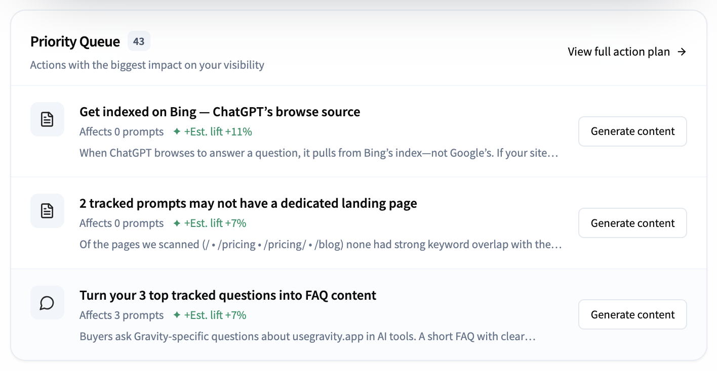
Mention rate summarises how often AI assistants mention or recommend your brand across the prompts you track. Higher is better.
A line chart of your mention rate over time. Use the dropdown (default 30 days) to switch between 7, 30, or 90 days. Hover any point to see the exact value and date.
Small movement (a few points) is normal week to week — assistant outputs are non-deterministic. Look for sustained changes (3+ scans trending the same direction) or step changes that line up with content or product updates. If a single scan looks like a big shift, click into the underlying queries before reacting.
Prompt Coverage
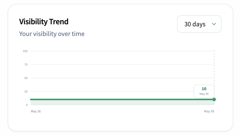
The donut shows what share of your tracked prompts you appear in versus the share where only competitors appear. In the example, coverage is 10% — you appear in 1 of 10 tracked prompts; competitors appear in the other 9.
- You appear in — count and % of prompts where you're cited.
- Competitors only — count and % of prompts where only competitors are cited.
- Total analyzed — total prompts behind the donut.
If you're new, this is the single most important number on the dashboard — it tells you how often you're even part of the conversation.
Headline stats
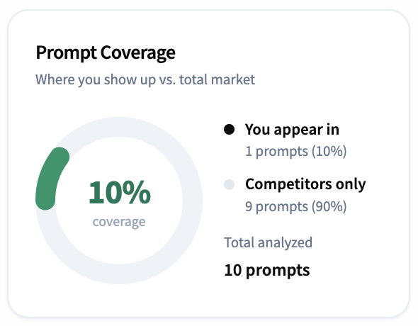
Four tiles at the top of the dashboard summarise how you're showing up in AI search. Each tile shows the current value plus the change versus the prior 30 days.
- Mention score — how often AI assistants mention your brand across the prompts you track. Higher is better.
- Average position — your average rank when you do appear in an answer (lower is better).
- Brand sentiment — the share of mentions that are positive. Shown as a % positive plus the point change versus the prior 30 days.
- AI referral visits — visits to your site attributed to AI assistants over the last 30 days.
Tip
If a stat drops sharply versus the prior 30 days, check the Queries page first — a model update or refusal can show up as a temporary dip before stabilising.